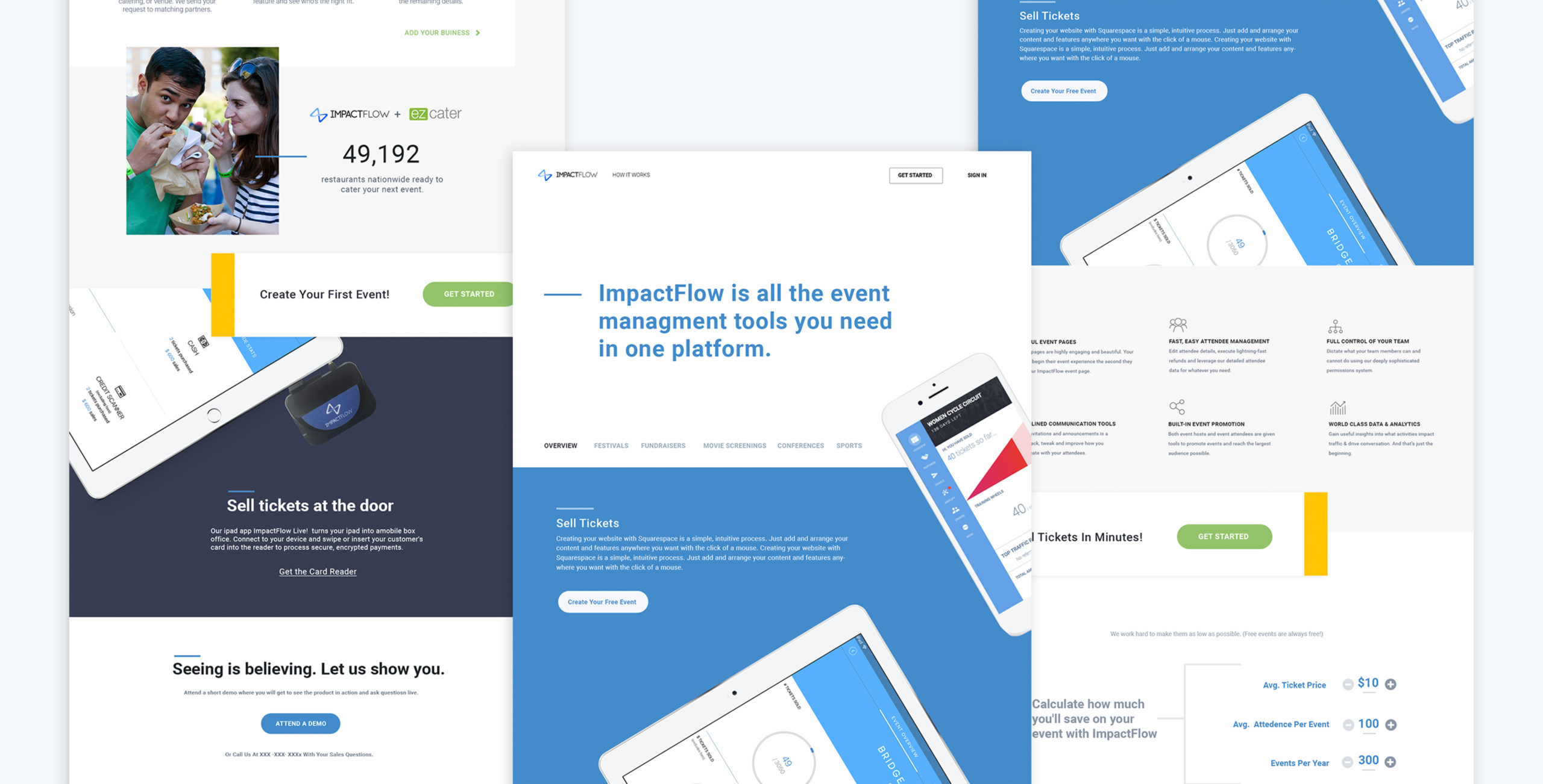
ImpactFlow Website Design
Role: User Research + UX + Art Direction + Strategy
THE
CHALLENGE
Customers were getting lost and confused trying to understand what ImpactFlow could do for their organization. The lists of features were overwhelming and not always applicable. ImpactFlow had an extremely high bounce rate of 80% and a very low organic conversion rate.

THE
PROCESS
After completing a series of brand strategy and product offerings sessions. I quickly understood it required a bit more thought to convey the benefits of how ImpactFlow simplified the complexity of both attending and hosting events.
Depending on a user’s flow through the site, they might not experience ImpactFlow’s three main offerings. I moved into UX and UI discovery for the updated site. My discovery process allowed me to define the site architecture and produce a visual sitemap; identify media needs such as custom iconography and photography; producing wireframes of defined pages; and finally, translating it all into a visual design. We designed a lot of this content as repeatable modules, which allowed us to reuse it throughout the site to bolster this message. It also allowed us to create consistency across the site, delivering a unified web experience and speeding up the design and development process.


THE
RESULTS
The new website design drove unheard percentage engagement and a 72% improvement in the bounce rate. Typically sites experience a maximum 3% engagement with links and content on the page. With the new pages, we saw 22% engagement with links and other content. Prospects found the new website helpful in understanding how ImpactFlow would work for their organization. We decided to make some tweaks and continue testing.


