THE
CHALLENGE
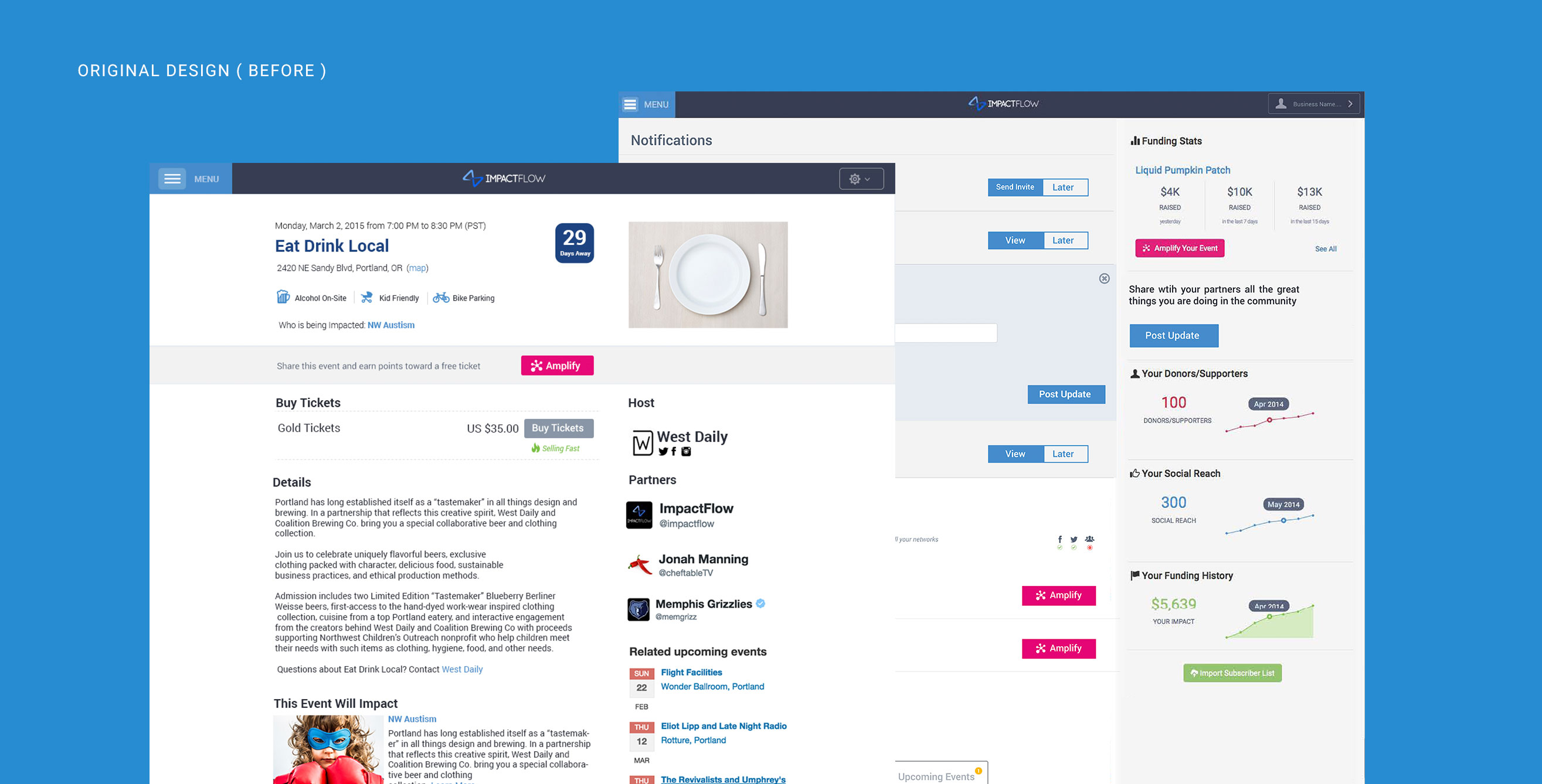
This redesign was a dream assignment: imagine getting the opportunity to build an experience that lays the foundation for the future of ImpactFlow. Events are complicated. But the true challenge was to leverage existing capabilities while also creating a cohesive end-to-end experience designed to serve both host and attendee needs.


THE
PROCESS
The most important step at the start of a project like this is formulating the right questions since each answer introduces constraints that shape the final outcome.
Beyond the first clear-cut decision to design mobile friendly-first, the team probed to understand attendees and event host motivations and behaviors. We conducted an expansive research phase including user research with our current users, stakeholder interviews, and experts in the industry.
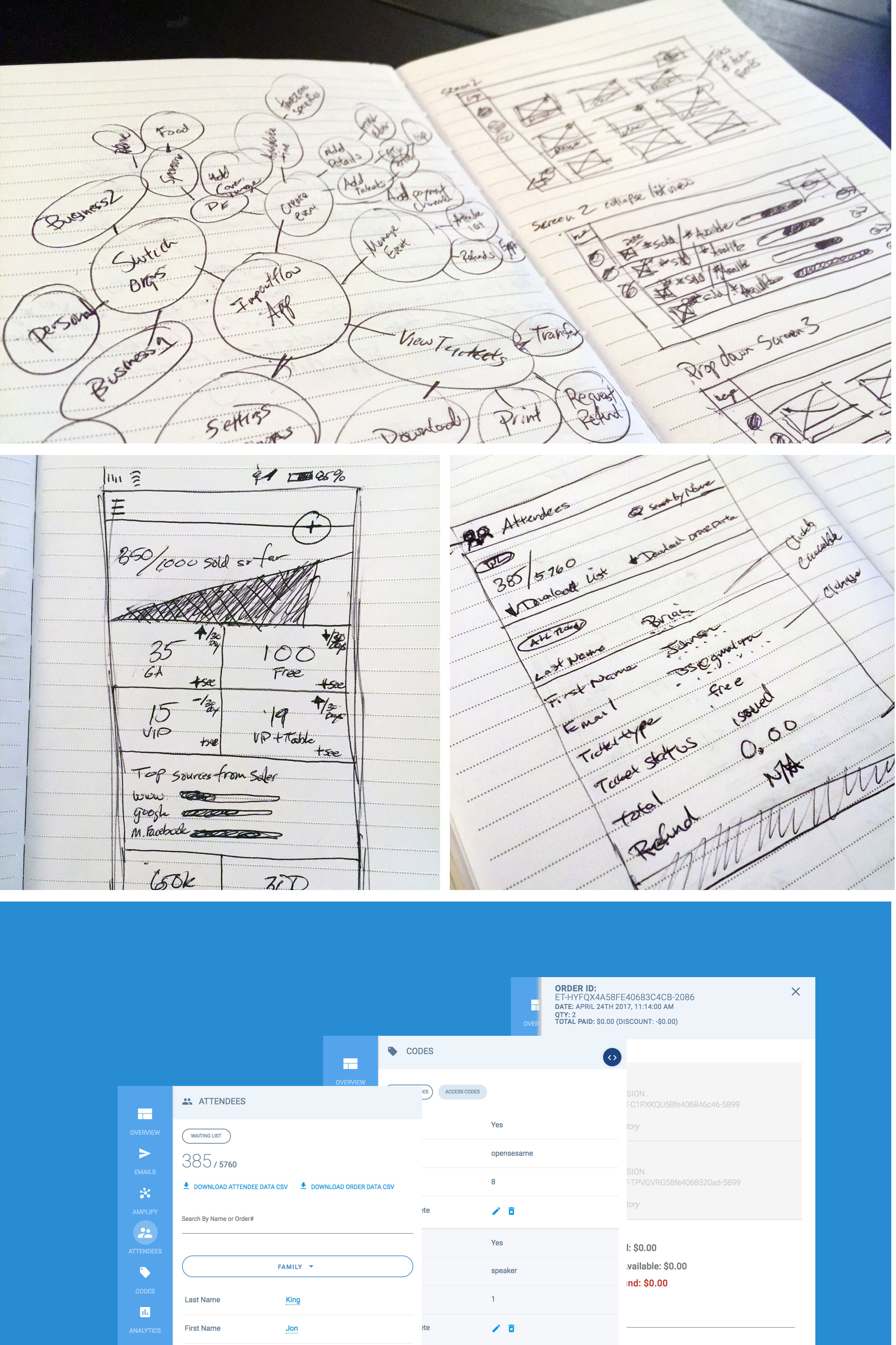
The research phase concluded with a design-led conversations involving all stakeholders. We worked to address the different phases of the customer journey. Those dreams became paper prototypes. With such an expansive product, I choose to go beyond wireframes and create rapid prototypes for every view and interaction. This product would be used by an audience that spanned tech-savvy to tech-illiterate. I believe wireframing and prototyping go hand-in-hand ensured a complete and thought-out user experience.
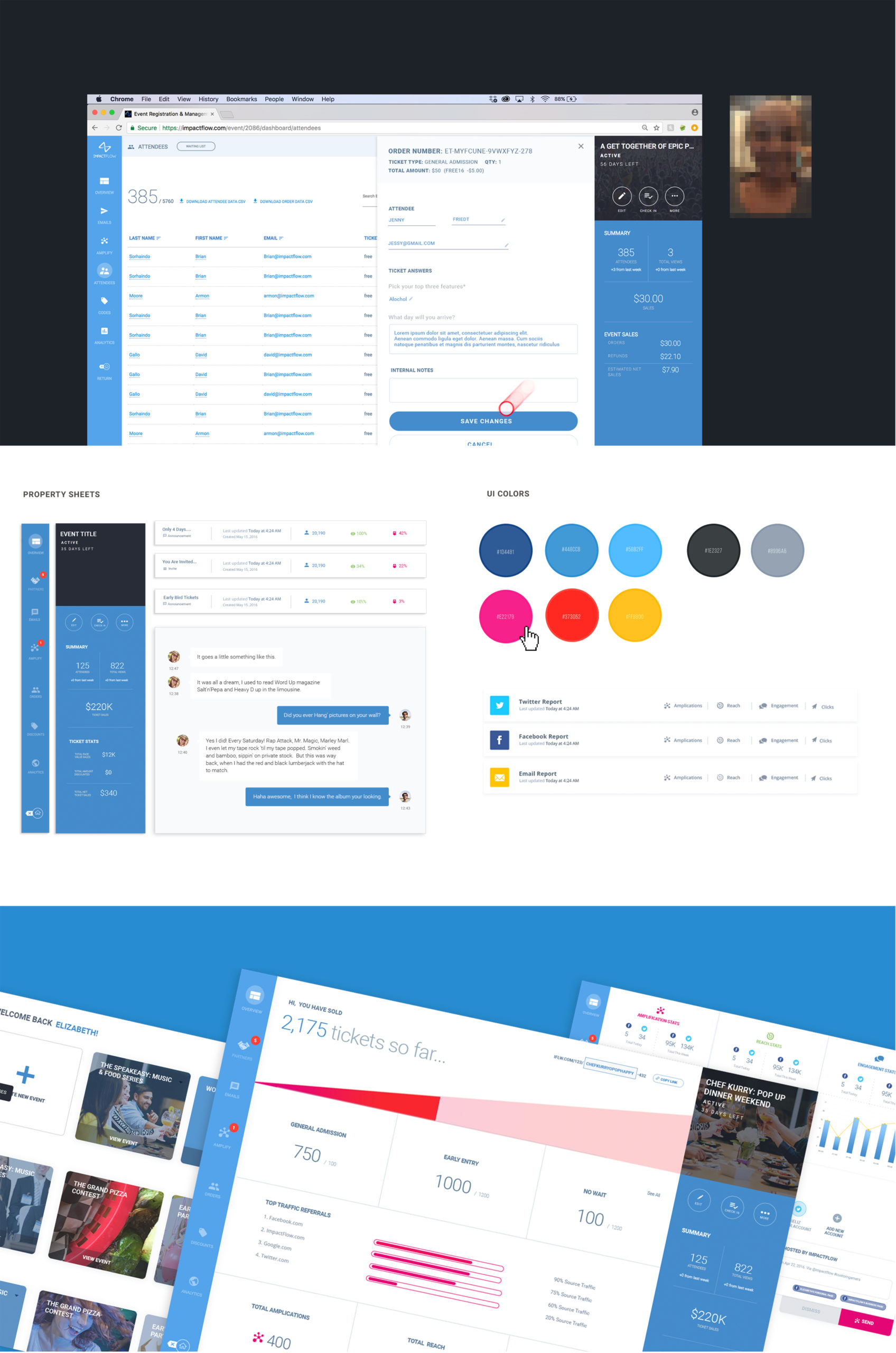
In visual design, we contrasted the table-heavy content with an abundant use of white space. The supporting palette of ImpactFlow blue allowed us to use color as an effective tool to call attention to crucial parts of the product. A custom set of iconography helped lend approachability while aiding in interface navigation. Technically the project was very challenging and pushes the boundaries of what is possible in the web browser. Ultimately we settled on a stack of technologies including Javascript, WebGL, Python, Redis.

When we tested the new designs with users, they loved that they could see an overview of the events that were important to them. In the first iteration, we tested combining the management ability for the user with multiple organizations into one view. The majority of people clicked on the option to separate the views at the bottom, even though it was relatively hidden. We learned that customers wanted to see each organization they manage in a separate view.
Beyond the essential tools you need in event management solution. We aimed to give event host a design that showcased the power of data and automation. 
THE
RESULTS


