THE
CHALLENGE
and simple iOS app to assist event hosts with on the go management taskbecame a major business need.
THE
PROCESS
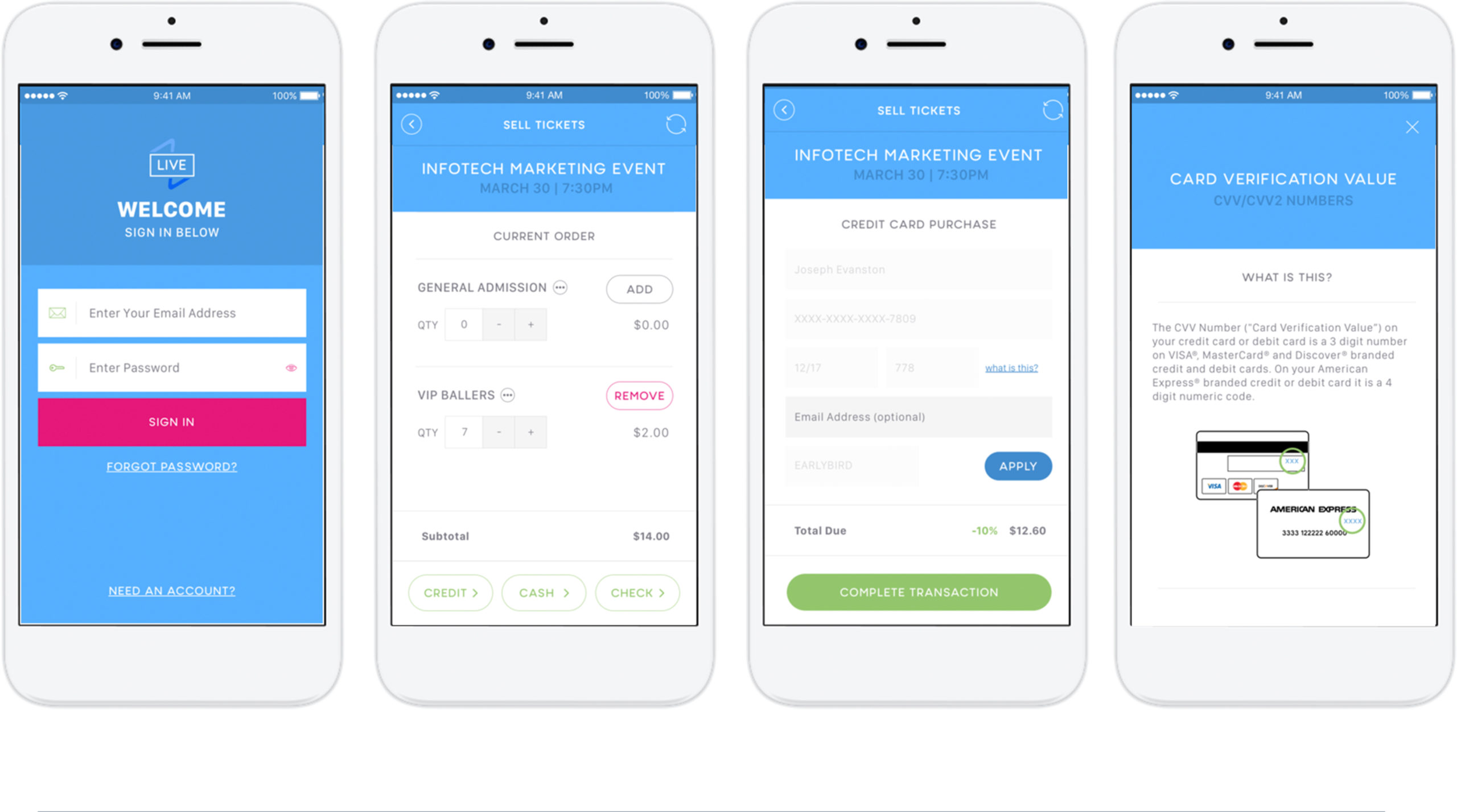
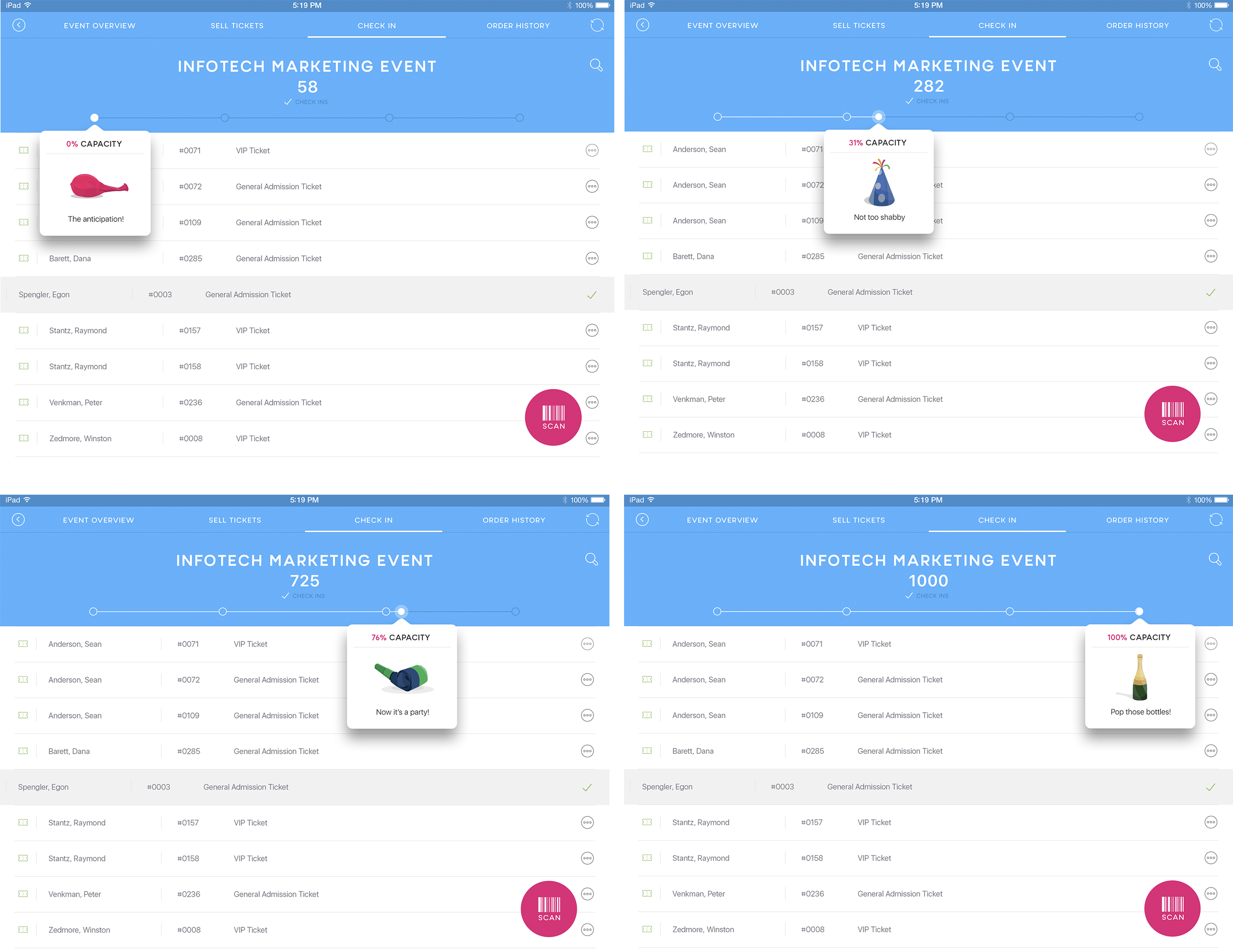
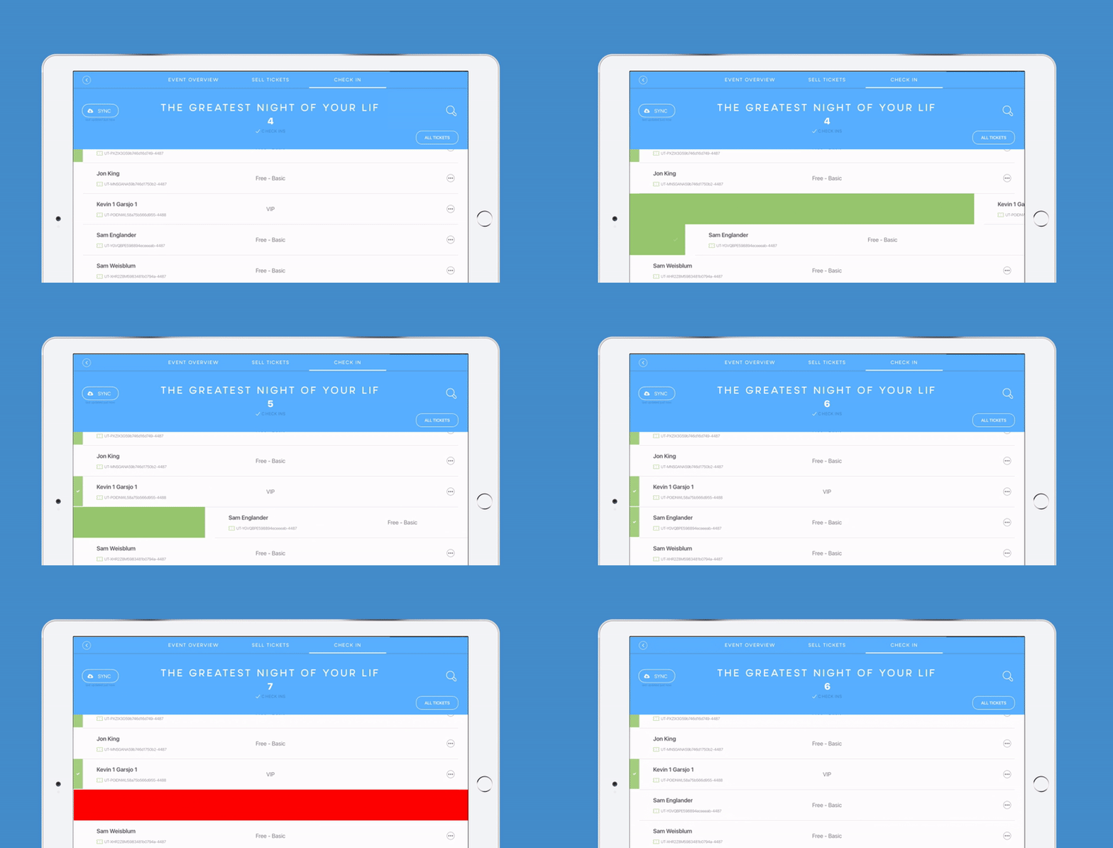
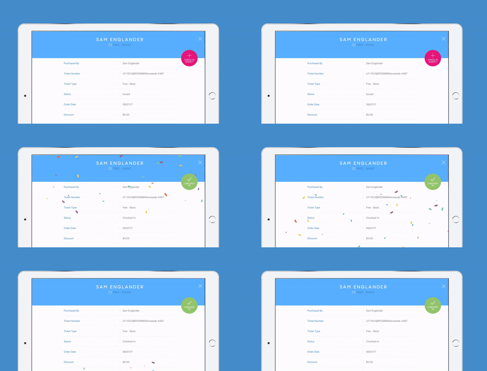
Many hours were spent talking to the event host, festival managers, and customer success staff to gain insights and understanding into the problem. During the research, we discovered this project faced many challenges not only from technical capabilities and UI design perspective. A few of the challenges that the design and engineering had to face were offline interaction and offline payment processing. A high level of detail had to be given to the UX to ensuring it was as simple to use with hundreds of user syncing data in real-time, along with the user base ranging from a movie theater employee to a volunteer festival worker.
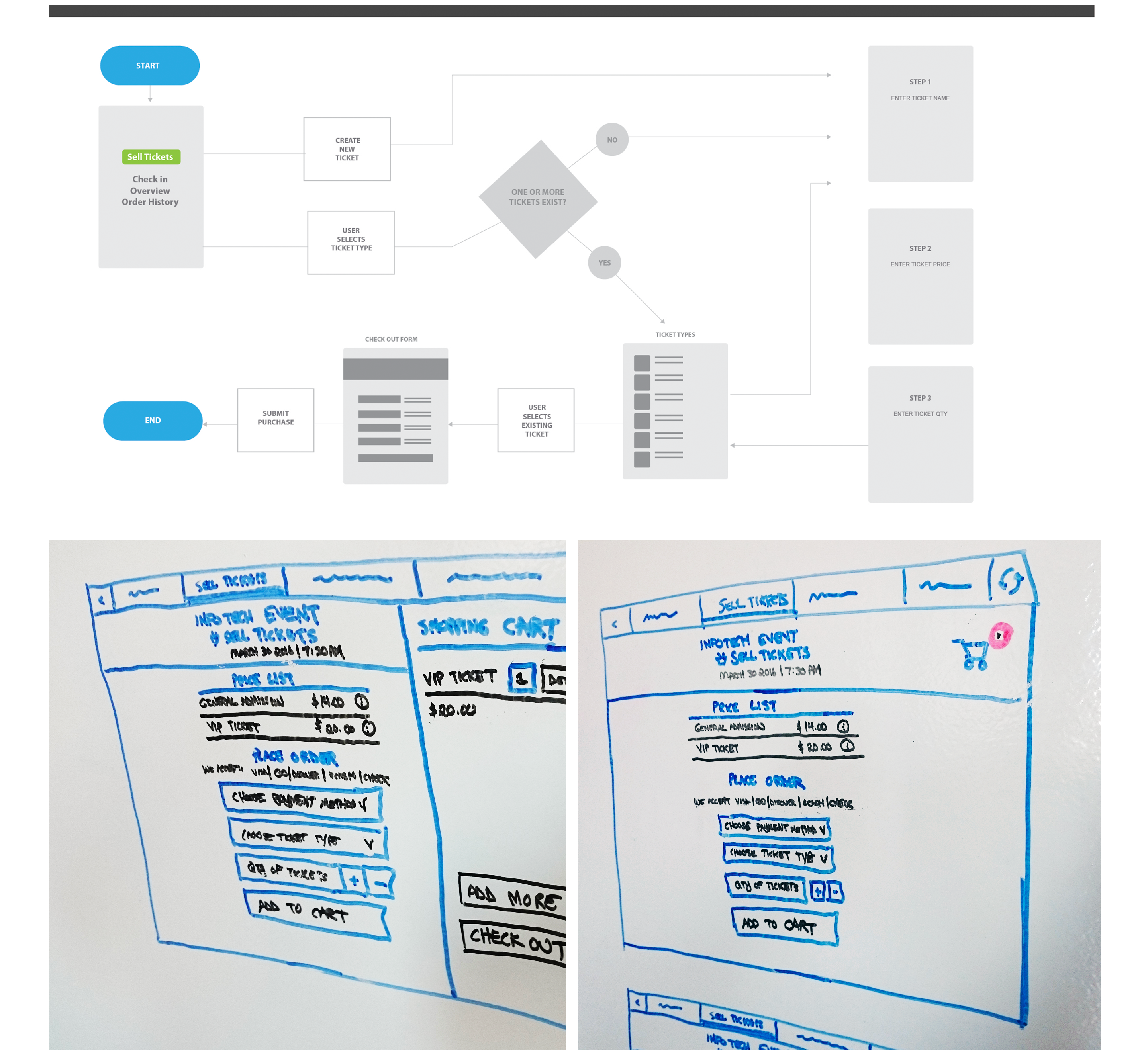
Once the requirements were locked in the design team lead group sessions with stakeholders. The goal of these sessions was to mind maps, discuss the requirements and timelines. Following these sessions, sketches and hand-drawn concepts were presented to the stakeholders. At the end of this process, the UX principles were created and the most viable concept was moved into interactive prototyping. A huge screen in the office continuously showed rotating examples of prototypes and high fidelity visual designs. The living room screen became a talking point during company socials and made employees feel involved in the creation of progress. From a design and user experience perspective, the goal was to make the software an extension of the ImpactFlow brand and embody aspects of our visual and voice identities. This meant it had to be simple, engaging, supportive and nurturing. Anyone viewing this as a stand-alone app there needed to be no mistake of the benefits and where the journey originated. A major consideration was accepting the fact that swipe interactions and image scanning aren’t for everyone.
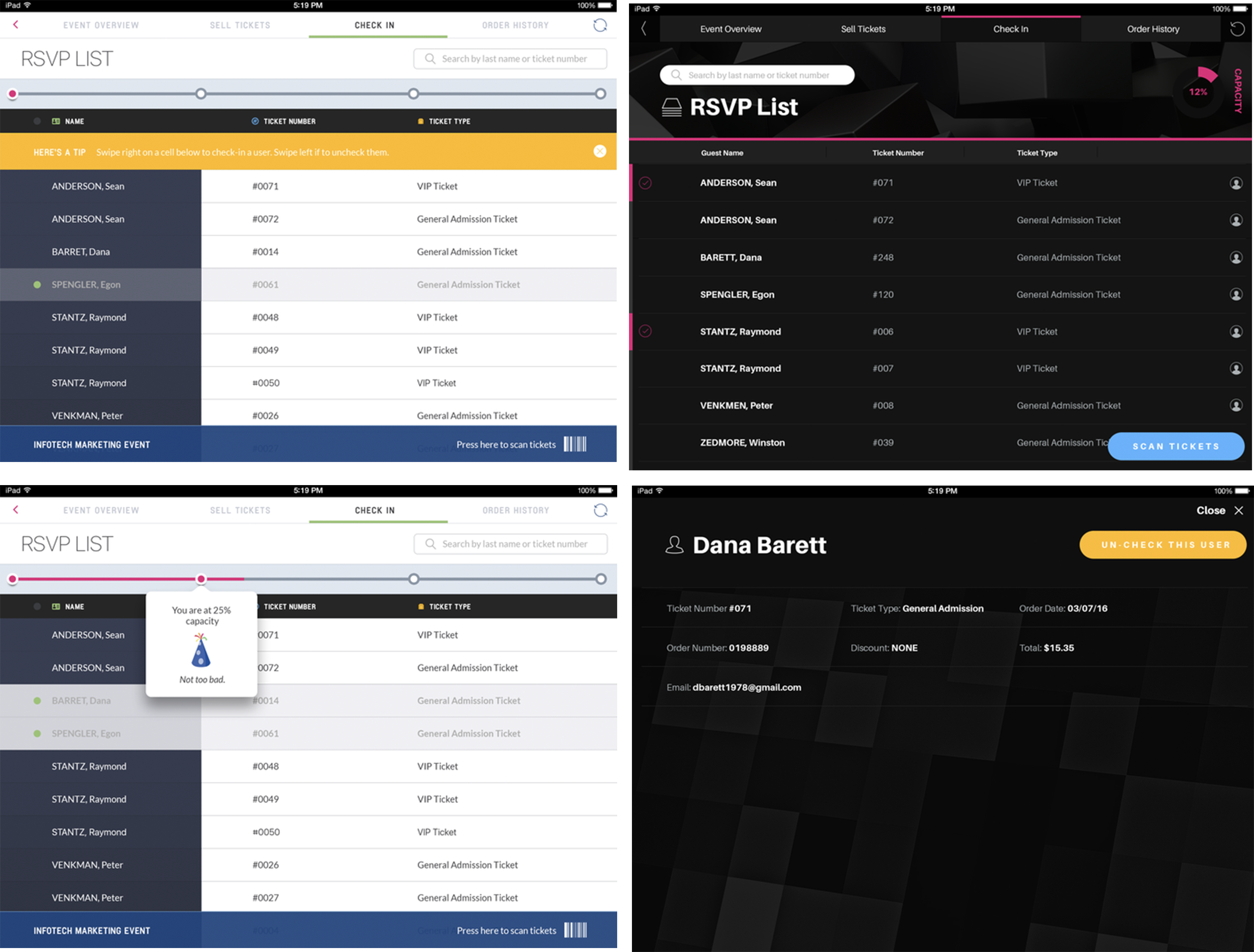
The product road map kicked off with the first version of the app. The goal of this release was to give event host a native app to do the core aspect of running an onsite box office which includes tasks like ticket sales, managing refunds and sales summaries. Version two, added in credit card swipe ability, ticket scan functions, and permissions settings.
